Add to Cart
Create the perfect purchase flow
The "Add to Cart" element is a fundamental component of any e-commerce website. It serves as the primary mechanism for customers to initiate the purchase process, allowing them to accumulate selected products in a virtual shopping cart before proceeding to checkout.
Essentially, it's a user interface element (typically a form) that, when activated, triggers the addition of a specific product (and often a specified quantity) to the customer's shopping cart. This seemingly simple action is crucial for a smooth and efficient online shopping experience.
This document will delve into the various aspects of implementing and designing effective "Add to Cart" elements when using Smootify.
Before deep diving in all the different Custom Elements and Custom Attributes you can use, let's first understand a key concept, "Variants".
In the world of e-commerce, offering product variations is essential for catering to diverse customer preferences. Shopify's "product variants" feature allows you to sell different versions of a single product, such as different sizes, colors, materials, or styles, all from a single product page or listing. The add to cart is fundamental for this feature, since is the only part of your site where customer can choose which variant to add to their cart.
What are Shopify Product Variants?
Product variants are different versions of a single product that share the same core attributes but differ in specific characteristics. These characteristics are defined by "variant options," which are attributes like size, color, material, etc.
Example:
A t-shirt might have the following variant options:
- Size: Small, Medium, Large, Extra Large
- Color: Red, Blue, Green
Each combination of these options (e.g., Small Red, Medium Blue, Large Green) constitutes a unique product variant that can have a different price and inventory.
Shopify allows you to create up to 3 option sets and based on your store up to 100 or 2k variants.
Why variants are not imported inside Webflow CMS?
Seen the large amount of variants you can create in Shopify, the limitations that Nested Collections List do have in Webflow (max 10 items showned), and the low limit of CMS items you are allowed to create on Webflow CMS (max 20k on the highest priced site plan - before enterprise), we've decided to avoid syncing variants with the CMS. Everything related to Product Variants is JS rendered with attributes, so keep it in mind while you design. You will see the result only on the published site and not in the preview of Webflow. (Webflow Canvas allows only custom css code, js code is stripped out for security reasons)
Smootify Add to Cart
The Smootify Add to Cart is a powerfull Custom Element that will allow your customer to easily select variants, customize products and add them to the cart. All without losing the design freedom you require.
Generally speaking, the Smootify Add to Cart is a Custom Element that wraps the native Webflow Form. This allows a lot of benefits:
- Standard HTML: Forms are a standard HTML element, ensuring broad compatibility across browsers and devices.
- Accessibility: Forms are inherently accessible to users with disabilities, particularly when used with proper labels and ARIA attributes.
- Input Validation: Forms allow you to implement client-side validation to ensure that the data entered by the user is correct and complete. For example, if you add a custom property to your add to cart to gather additional informations (like an Engraving text), you can ensure that the form doesn't get submitted without that field being properly validated. All natively by the browser.
- Inside Webflow form you can add all kind of inputs you wish, without having to struggle with custom embeds.
- Webflow forms already have error messages that can be used to inform the customers about the errors that could happen - E.g your user added already all in stock products to the cart and tries to add more.
If you want to kickstart your project without having to customize everything on your own just copy our element
Add to Cart
Copy Element
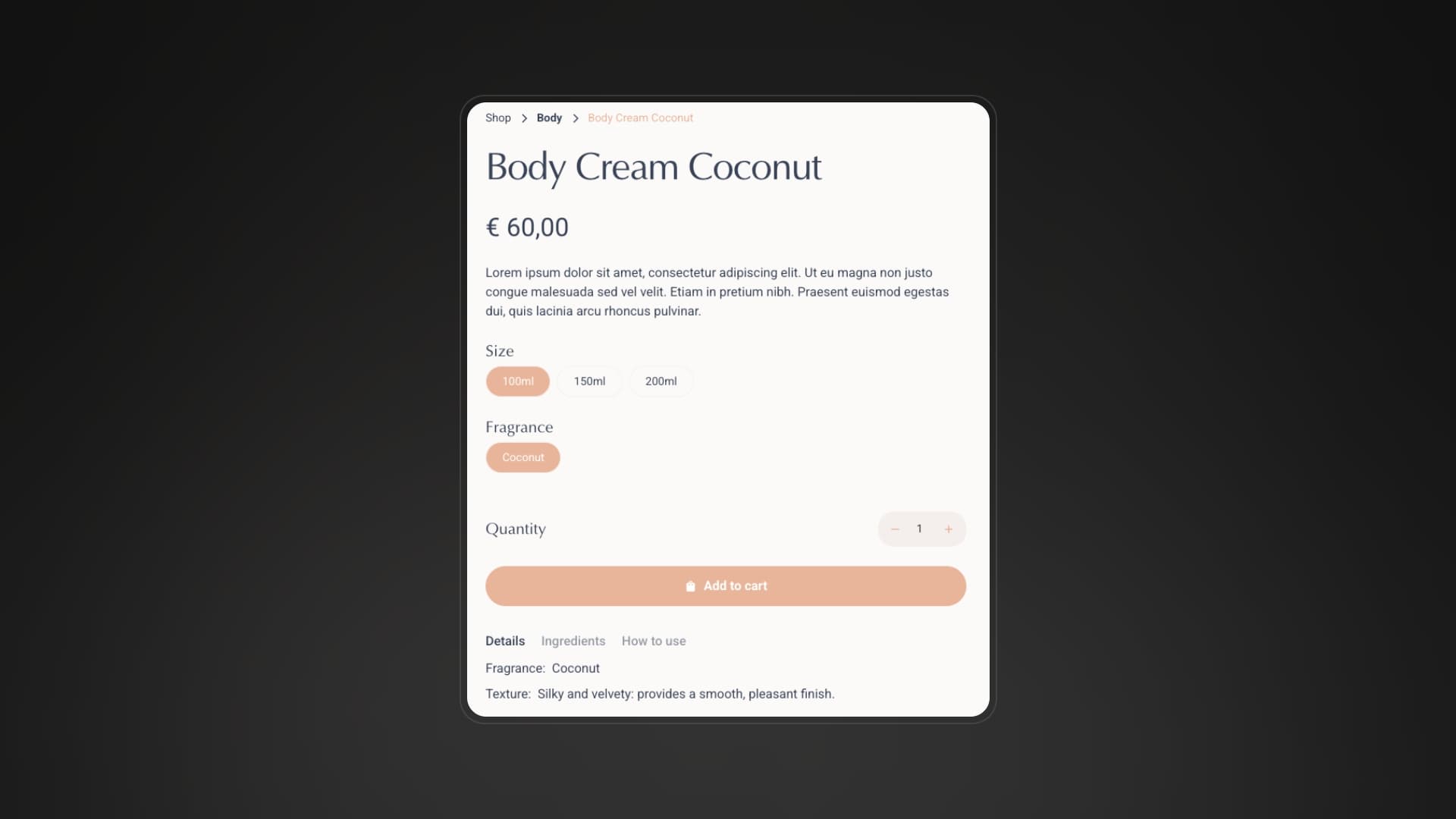
Our element includes everything you need to start, variant selectors are already defined with both swatches and dropdowns (swatches for first option set and dropdown for the other 2 sets), a quantity input, a buy button and a direct checkout button. You will just have to paste the component inside the Product Custom Element and you are good to go.
All parts of the Add to Cart
Below, you'll find a comprehensive breakdown of the various components that typically comprise an "Add to Cart" form. Each element plays a crucial role in capturing and transmitting the necessary data to facilitate the purchase process. We'll explore the purpose and functionality of each part, from input fields for product selection and quantity to additional fields that you can use to gather user informations. This detailed examination will provide a clear understanding of how these elements work together to create a robust and efficient "Add to Cart" experience.
Buy Button
For a perfect UX, Form accessibility and design freedom, instead of using native Webflow submit inputs (that you can use the same if you wish).
The Buy Button is instead a Custom Element with tag button (a real button basically) that has the custom attribute:
This basically just informs the browser that a click on that element will submit the form, and that's exactly the perfect purpose for it!
Why a custom element and not the native submit input?
Legit question! And the reason is pretty simple, we wanted to allow an higher design freedom, a submit input allows you only to change the value of it (that is rendered as the text), so to add a loading state or even an icon you have to use custom css, paddings and background images.
A <button> element, instead, allows you to add inside it different other elements, like icons and texts, this is a lot easier to style without touching up the code and doesn't influence at all the accessibility of the form!
Buy button
Copy Element
Element Structure
The element you can copy from this section is a Custom Element with tag button and inside 2 different Div Blocks
- The 1st
Div Blockhas the custom attribute
and inside has an icon and a text, this is the Div Block that you will see inside the designer
- The 2nd
Div Blockhas the custom attribute
the class is-hidden (it doesn't show in the designer) and inside it has an icon and a text. This Div Block will be visible to customers when they press the Buy Button
Combo Classes
Dynamically Smootify scripts automatically disable the Buy Button by adding the is-disabled class when the selected variant is unavailable.
Design your button styles accordingly to provide the UX you desire.
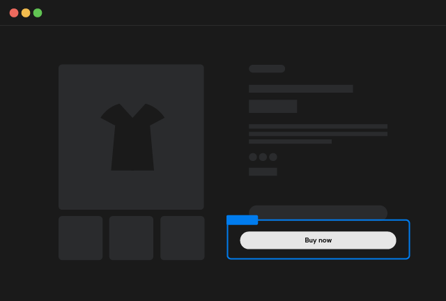
Buy Now Button
The Buy Now Button is the same exact component as the Buy Button with 1 only difference.
There is an additional custom attribute applied:
By clicking this button the customer will be redirected to the Checkout.
Buy Now button
Copy Element
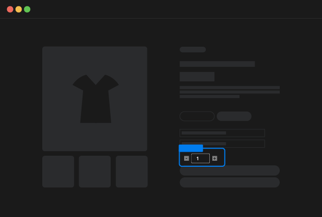
Quantity Input
The quantity input component is an user interface element designed to facilitate the selection of numerical values. It provides a structured way for users to increment, decrement, or directly input a desired quantity. This component includes interactive elements like increment and decrement buttons, as well as a numerical input field, to enhance user experience.
Quantity Input
Copy Element
Element Structure
The element you can copy from this section is a Custom Element with tag ``quantity-input` and inside 3 different elements:
- A
Custom Elementwith tagbuttonand Custom Attribute:
This button is the Decrement button
- An
Inputelement of type number.
Quantity Breaks
This element supports quantity breaks of Shopify, that is a feature exclusive for Shopify Plus. That allows you to define minimum, step and maximum quantities available to purchase
- A
Custom Elementwith tagbuttonand Custom Attribute:
This button is the Increment button
Combo Classes
Dynamically Smootify scripts automatically disable both button elements by adding the is-disabled class when the selected quantity is either the min or the max purchasable quantity
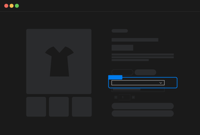
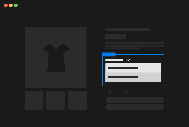
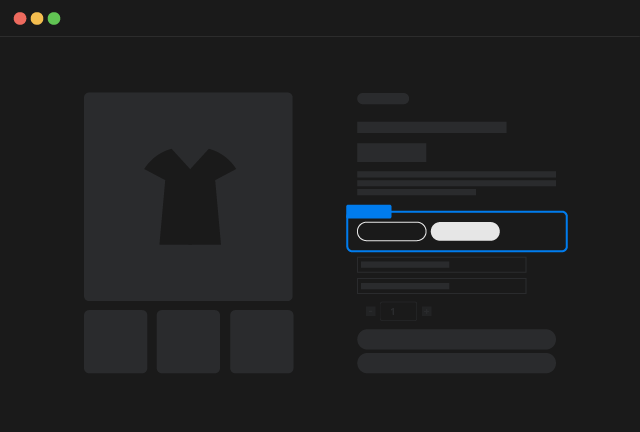
Variants Selectors
We recommend designing your product pages to support all three possible option sets. Don't worry if some products don't use them all; our system will automatically clean up the display, ensuring a clean and relevant experience for your customers.
For each option set, you can choose from three display styles: selects, dropdown menus, or swatches. Feel free to mix and match these styles as needed by your design!
All display style elements do have 1 thing in common, the Custom Attribute:
Where the available indexes are 1, 2 and 3.
This attribute allows Smootify to correctly render the data of the corresponding option set inside the element you designed.
Always design the 3 option sets
You should always design correctly the 3 option sets. Be sure to have 1 and only 1 selector for each option set. So double check that you have:
-
Exactly one selector, irrespective of its display type, with the attribute
NameValue -
Exactly one selector, irrespective of its display type, with the attribute
NameValue -
Exactly one selector, irrespective of its display type, with the attribute
NameValue
Variant Select
The "variant select" is the most common and usual interface element that allows your customer to choose different values of an option set.
Is basically a form select where dynamically the options will be rendered based on the values you have in Shopify for that specific option set.
Variant Select
Copy Element
Element Structure
The component is very simple and it's a Custom Element with tag variant-selector and inside:
-
A
labelelement which text will be dynamically replaced by the Name of the corresponding option -
A
selectelement with dynamically rendered options
Do not forget to change the CustomAttribute
that you find in the copied component, with the index you require. Where the possible indexes you can use are 1, 2 and 3.
Variant Dropdown
The "variant select" is the most common and usual interface element that allows your customer to choose different values of an option set.
Is basically a form select where dynamically the options will be rendered based on the values you have in Shopify for that specific option set.
Variant Dropdown
Copy Element
Element Structure
The component is very simple and it's a Custom Element with tag variant-dropdown and inside:
-
A
labelelement which text will be dynamically replaced by the Name of the corresponding option -
A
Dropdownelement with dynamically rendered options
Do not forget to change the CustomAttribute
that you find in the copied component, with the index you require. Where the possible indexes you can use are 1, 2 and 3.
Variant Swatches
"Variant swatches" are a visual enhancement used in e-commerce to improve the way customers select product variations. Instead of traditional dropdown menus, variant swatches display options as clickable visual elements.
They provide a more intuitive and visually appealing way to display product options like colors, patterns, or materials.
This is especially helpful for products where visual differences are crucial.
This can lead to a more engaging and efficient shopping experience.
Variant Swatches
Copy Element
Element Structure
The component is a Custom Element with tag variant-swatches and inside:
-
A
labelelement which text will be dynamically replaced by the Name of the corresponding option -
3
buttonCustom element placeholders with 3 different classes applied, in this way directly in the designer you can easily style the 3 accepted states that a button can have
In particular there are 2 combo classes that are dynamically applied:
is-activewhen the button has been pressed or is automatically selected;is-disabledwhen the button is associated to a value that cannot be selected, this happens when for example you have 2 or more option sets and the combinations are not fully exhaustive. E.g: you sell a t-shirt that has Sizes (SM, M, L) and Colors (Blue and Red) but the combination M / Red doesn't exists.
Do not forget to change the CustomAttribute
that you find in the copied component, with the index you require. Where the possible indexes you can use are 1, 2 and 3.
Variant swatches provide extensive styling flexibility. By utilizing Shopify's native swatch functionality or Option Metaobjects, you can dynamically modify the button element to reflect product variations.
To further style up the button you can use several attributes, remember to add them to the first button you find in the component you can copy in this section. The first button is the one that will act as template and dynamically duplicated, the other 2 are just for styling the combo-classes!
- Shopify Swatches
Shopify has announced native Swatches during “Winter 2024 Editions”. Some category of products do support automatically color/image swatches, so if your products do fall in between these categories you can use native swatches that Shopify do create automatically for them.
Let's breakdown the possible attributes for native Shopify Swatches:
Title
You can dynamically change any text element of your button by adding the attribute:
Image
You can dynamically change any img/div element (as background) by adding the attribute:
Color
You can dynamically change any text element color by adding the attribute:
Background Color
You can dynamically change any element background color by adding the attribute:
- Options Metaobjects
Options Metaobjects are instead a feature provided by Smootify that allows to style button swatches with unlimited fields!
First of all you need to create 2 definitions in your Shopify panel, so follow up these simple steps:
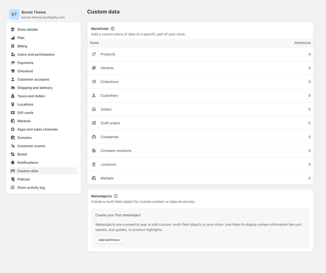
Open the custom data panel
Metaobjects and Metafields definitions can be created from your Shopify Panel > Settings > Custom data
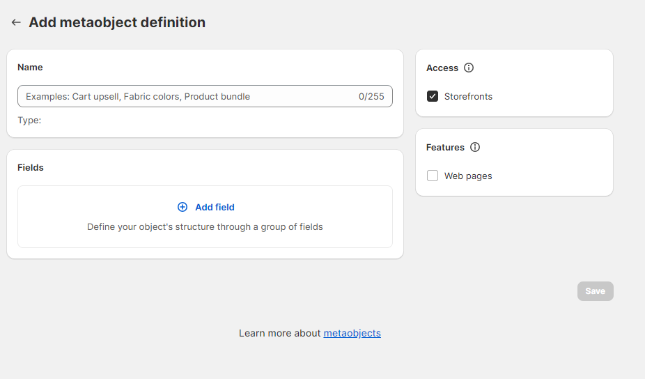
Create a Metaobject Definition
On the metaobject section press on Add definition
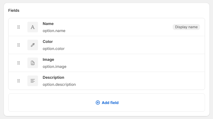
Add 4 mandatory fields
Add four fields by following strictly name and type of the field
| Name of the field | Type of the field |
|---|---|
Name | Single Line Text |
Color | Color |
Image | File |
Description | Multi Line Text |
[Optional] Add other fields
If you need more fields, you can add any other additional field to this metaobject definition
Save
Save your metaobject definition
Open the custom data panel
Open again the custom data panel. Metaobjects and Metafields definitions can be created from your Shopify Panel > Settings > Custom data
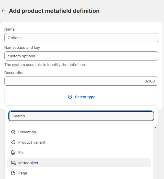
Create a metafield for Products
Create a metafield definition for the Products with these specific options:
| Name of the option | Value of the option |
|---|---|
Name | Options |
Namespace and Key | custom.options |
Type | Metaobject |
Reference | Option |
One Entry / List of Entries | List of Entries |
Populate your Products
For each product you will find a metafield selector that will allow you to select/create new Option Metaobjects.
Use the correct name
Note that the name of the Option metaobject must match the name of one of your Option Values. For example if you have a Product with the options
| Name of the option | Values of the option |
|---|---|
Color | Blue, Red, Yellow |
Material | Leather, Cotton |
and you want to create an Option Metaobject for each of the values you have to create the metaobjects with respectively the names:
Blue, Red, Yellow, Leather and Cotton and inside the product you have to select all the metaobjects you wish to show
Let's breakdown the possible attributes for Option Metaobjects:
Title
You can dynamically change any text element of your button by adding the attribute:
Description
You can dynamically change any text element of your button by adding the attribute:
Image
You can dynamically change any img/div element (as background) by adding the attribute:
Color
You can dynamically change any text element color by adding the attribute:
Background Color
You can dynamically change any element background color by adding the attribute:
Additional Fields
You can dynamically change any element based on the type of the additional field you created by using the attribute:
For example if you created an additional field with name Discount Percentage
You have to use the attribute
Subscription Swatches
Shopify Headless stores do support Subscription products, that you can create with any app you do prefer, we do suggest using the native Shopify Subscription App that is free of charge and integrates greatly with the Shopify Customer Dashboard!
Shopify Subscriptions are created in this way, you create Subscription Groups that are simply titles (E.g: premium plan, elite plan, etc), and inside each Subscription Group you create different Delivery Options like (every 1 year, every 1 week, etc). For each Subscription Group you can also offer a discount
To allow your customers to select if they wish to buy the product once or with a subscription you can use our component:
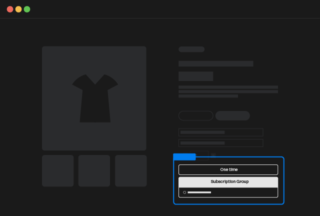
Subscription Swatches
Copy Element
The element will show only for products that can be sold in subscriptions so you can add it freely in the product template add to cart without worrying about it
Element Structure
The element you can copy in this section is a Custom Element with tag subscription-swatches and inside just Tabs
The Tabs will come with 2 Tab Links
-
The 1st
Tab Linkthat allows your customer to unselect a subscription group (One time purchase), it has and hiddenTab Paneand will be automatically deleted if you've set your product has purchasable only as a subscription -
The 2nd
Tab Linkis a template for the subscription groups you created in Shopify and will be replicated once for each subscription group associated to the product, thisTab Linkis associated with aTab Panethat inside has a radio button field, the radio button field will allow your customer to select which Delivery Option they do prefer
When you click on any of the Tab Link the first Delivery Option that is associated with that Group will be automatically pre-selected. So if you know that for example all the subscription groups do have only one delivery option, you can even set the Tab Pane as hidden
Preselect Subscription Delivery Option
In some cases like in SAAS stores you could have a situation where you need to auto select the Subscription Group and the Delivery Option.
For example this happens in Pricing Pages where you sell same product with different tiers (like monthly and yearly).
You can just preselect the correct delivery option by adding 2 custom attributes on the Subscription Swatches dom element
For example if you want to select the 2nd delivery Option inside the subscription group called "Premium" you have to use the attributes
Add to Cart Properties
Shopify platform allows you to add custom fields to your Add to Cart element to gather extra details from your customers, those are usually called as Properties, and you will see them in the order overview in the backend.
This is really usefull when you need to sell products that are customizable like for example a Jewel that requires an Engraving text, etc.
To collect these custom informations, you have just to add any kind of field you wish in the Add to Cart, at the end is just a Form, so any native input of Webflow will be automatically accepted as Property by Shopify.
You can influence the visibility of the Property on both the cart and on the checkout by adding an underscore _ as prefix of your Input Name. Properties that have an underscore as prefix are known as Hidden Properties and are visible only from the backend.
Properties are not comparable to Options
Properties are way different from Options. Shopify Options are connected to Variants and do have access to quantity stock and prices.
Properties do not influence the price of the Variants. (Unless you use our Server Add-on Product Configurator 😉)