Search & Discovery
Create a seamless product discovery experience.
The Shopify Search & Discovery app is a powerful tool that grants merchants enhanced control over how customers navigate and discover products within their online stores. By leveraging its features, you can significantly improve the user experience and drive sales through refined search and personalized recommendations.
Key Features and Benefits
The Search & Discovery app offers a suite of functionalities designed to optimize product discovery:
1. Custom Filters for Enhanced Navigation:
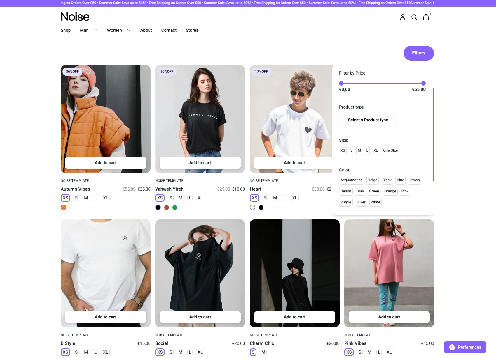
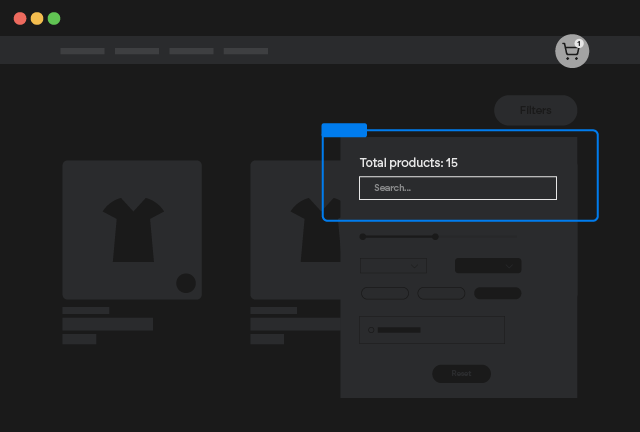
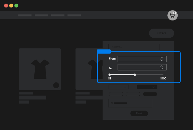
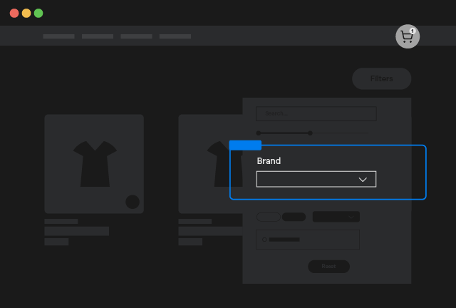
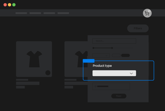
- Refine Search and Collection Pages: Create custom filters that enable customers to narrow down their search and collection results based on multiple categories. This granular filtering allows users to quickly locate specific products that meet their precise requirements.
- Surface Relevant Results: By empowering customers to filter by relevant attributes like size, color, material, price range, and more, you can ensure that they are presented with highly targeted and relevant product listings.
- Improved User Experience: Custom filters streamline the browsing process, reducing the time and effort required for customers to find desired products.
2. Semantic Search and Synonym Groups for Intuitive Results:
- Activate Semantic Search: Enable semantic search to improve the accuracy and relevance of search results by understanding the intent behind customer queries, rather than relying solely on keyword matching.
- Create Synonym Groups: Define synonym groups to ensure that customers find relevant products even when using different terminology. For example, grouping "sneakers," "trainers," and "athletic shoes" together ensures that all relevant products are displayed regardless of the specific term used.
- Enhanced Search Accuracy: By understanding the context and meaning of search queries, semantic search and synonym groups deliver more intuitive and accurate results.
3. Product Featuring in Search Results:
- Highlight Key Products: Feature specific products in search results to promote best-sellers, new arrivals, or promotional items.
- Strategic Product Placement: Control which products are displayed prominently in search results to drive sales and achieve marketing objectives.
4. Result Type Adjustment in Search and Predictive Search:
- Customize Search Results: Fine-tune the types of results displayed in search and predictive search to prioritize specific content, such as products, collections, or pages.
- Optimize Predictive Search: Adjust the result types displayed in predictive search to provide relevant and timely suggestions as customers type their queries.
How to Setup [Shopify]
Install the App
Install the free Shopify Search & Discovery
Create Filters
You can follow official doc for full documentation on how to setup filters.
Review the following considerations for using the Shopify Search & Discovery app:
- Collections that contain more than 5,000 products don't display filters. Consider dividing large collections into smaller collections that can display filters. For example, instead of creating a single Women fashion collection, you can create smaller collections based on the type of apparel, such as Tops, Jeans, and Boots.
- A search that produces more than 100,000 results doesn't display filters.
- A filter can display a maximum of 100 filter values on your store. If your filter has more than 100 possible values, then some values won't be displayed to customers. You can reduce the number of possible filter values by grouping similar values. A filter group can have a maximum of 200 unique filter values, and your store can have a maximum of 1,000 filter groups across all selected filter settings.
- In the Shopify Search & Discovery app, a filter displays a maximum of 1,000 filter values. Metafield filters might display fewer than 1,000 values because there is a limit to how many metafields in the store are checked for unique values. Filter values not displayed in the app can still be displayed on your store to customers, provided the filter is displaying fewer than 100 filter values.
- Translations aren't supported for the Vendor and Tags filter values. The product tag filter only displays to customers shopping in your store's default language. Vendor filter values are always based on your store's default language.
- Filter value translations are based on the languages published for your online store, and won't display translations for markets set up with international sales tools.
- The price filter doesn't display for currencies other than your shop's default currency.
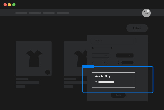
In the Shopify Search & Discovery app, go to Filters, and then click Add filter.
- Click the Source field, and then select a filter source that you want to make available to your customers.
- Optional: Rename the filter.
- Optional: Change the filter behavior.
- Optional: Change the visual display.
- Optional: Select filter values to group together as a single value.
- Optional: Sort filter values.
- Click Save.
How to Setup [Webflow]
Copy our Component
Search & Discovery
Copy Element
Customize the Options
On the Custom Element smootify-search-discovery there are different Custom Attributes that you can modify:
Limit
You can modify the number of products loaded by modifying the attribute
By default it's set as 50. You can set max 250
Disable Scroll
If you want to disable scroll when products are rendered add the attribute:
Disable Scroll on Load More
If you want to disable scroll when more products are loaded add the attribute:
Animation Name
The component uses Motion.dev to animate the card loading by default the animation used is fade, you can modify it by changing the attribute
Where animation name can be: fade, slide, slideBlurred, fadeBlurred
Animation Duration
By default the animation is set with a duration of 0.5s, you can modify it by changing the attribute:
Stagger
By default the products are animated with a stagger of 0.1s, you can modify it by changing the attribute:
Easing
By default the products are animated with an ease-in easing, you can modify it by changing the attribute:
Where easing formula can be: linear, ease, ease-in, ease-out, ease-in-out
Hide Empty Filters
By default the filters will show up even if the filters will show up no results, if you want to hide them, just add the custom attribute:
Hide if single
By default the filters will show up even if the filters have only one possible value, if you want to hide them, just add the custom attribute:
Sync Query Parameters
By default the filters will not sync filter configuration with the url of the browser, if you want to instead allow it just add the custom attribute:
Works only with Active Badges
This option will work only if you didn't removed the active badges from the component
Style the Filter Search
Inside the component you will find a Form with a text input and a submit button, style it according to your needs
Style the Grid Element
Inside the component you will find a Grid Element that will contain all searched products, style it according to your needs
Add the Filters
For each Filter you want to support in your template, you have to add a Component inside the Search & Discovery. Our component comes predefined with only Filter Search, Filter Price and Collection filter, you have to add the other filters you created in Shopify in the fashion you do prefer:
Search & Discovery Checkbox
Copy Element

Search & Discovery Dropdown
Copy Element

Search & Discovery Select
Copy Element
Search & Discovery Swatches
Copy Element

Search & Discovery Radio
Copy Element
Search & Discovery Search
Copy Element
Search & Discovery Price
Copy Element
Price Filter CSS Variables
Since natively Webflow doesn't support yet inputs of type "Range", this input is made as an embed code, you use the following CSS variables to style it:
range-slider-sizeby default the value is15pxrange-slider-colorby default the value isbluerange-slider-radiusby default the value is50%
Remember that you can add CSS variables directly inside Webflow Variables panel. Do not add them inside any folder!
Change the Label Custom Attribute
For each component you copied you must change the Custom Attribute:
In this way you will indicate that the Filter will be connected to the filter you created in the Search & Discovery App with the Label indicated in the attribute.
Filter Price & Filter Search
Do not change the labels for Filter Price & Filter Search components, they must be the predefined one from our components
Collection Filter
Even if Search & Discovery doesn't support filtering by Collection you can filter by collection by using the label Collection. You can't filter by multiple Collections at same time.
Only one Filter Section
You cannot use multiple filters connected to the same Filter of the Search & Discovery, there must be one and only one filter section per each filter you created in the Shopify Dashboard!
Collection Filter doesn't support Filter Search
When you are filtering by Collection, the filter search will be hidden, Shopify Storefront API do not support searching by name and filtering by collection at same time
[Optional] Preselect Value
If you want to create pages that do have preselected values, on each Filter Component you used you can add also the attribute:
You can naturally even connect the value of the attribute to the CMS in the case you want to use Search & Discovery on template pages like Vendor or Collection
By default filter sections that are Preselected are immutable, so you cannot allow clients to reset them. If you want to preselect but still allow the filter to be removed add also the attribute
[Optional] Change the Active Filter Label
By default the Active Filters elements will show up the with a text that follows this pattern
Label: Value
So if the filter section has the label Collection, they will show up as Collection: Name of the collection
If you want to use a different label, add the custom attribute:
Style the Sort Element
By default there is a sort of type Dropdown inside our Component. If you don't like the fashion or you accidentally deleted it and want to restore it, you can use the following sorters:
Search & Discovery Sort Select
Copy Element
Search & Discovery Sort Dropdown
Copy Element
Search & Discovery Sort Radio
Copy Element
Sort Values
Sort Values are fixed and defined by the Storefront APIs, so you cannot add different sorting methods. More over the sort values depends by if you are filtering by collection or not.
Without the collection filter being active you can sort by:
- Price
- Relevance
When you have an active Collection Filter instead you can sort by:
- Best Selling
- Created
- Price
- Relevance
- Title
You can change up the labels of the sort by adding the following script in the head of your webflow page
Style the Pagination Elements
Inside the component you will find 4 pagination buttons, with respectively the attributes:
and
You can style them according to your needs, do not keep all 4 buttons at the same time, or you use previous/next or you use one of the load more
Style the Active Filter Labels
Inside the component you will find elements that do indicate which filter is active at the moment, style them according to your own style.
Do not Remove
The option Sync Query Parameters will work only if you have this element. So if you want to keep using that option but do not want to use active filters elements, just set them as display none
[Optional] Design the Product Template item
You will find already a Pre-made example inside the component, if you don't like it you can either start from scratch or use other pre-made examples
Copy and paste the Product Custom Element inside the grid element of the Component.
Product Custom Element
Copy Element
Inside the Product Custom Element you can insert any static Webflow element.
For all the dynamic elements you can use inside the Product Custom Element with attributes or with other specific custom elements refer to the elements documentation
Set the data-id attribute if you started from scratch
If you started from scratch add the necessary data-id attribute.
Style the Empty State
Inside the component you will find an element with the attribute
This element will show up only and exclusively when there are no search results for that filtering state
Additional Attributes
Inside the smootify-search-discovery Custom Element you can use the following Attributes if you wish
Count
You can mark any text element as the number of products count by adding the attribute
Not for Collection Filters
Since Collection Filters are not effectively filters supported natively by Search & Discovery App, the count will not work since is not known the maximum number of products available when you are filtering by collection.