Magic Box
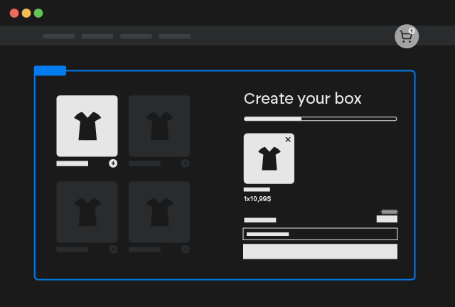
Dynamic Mix and Match bundles
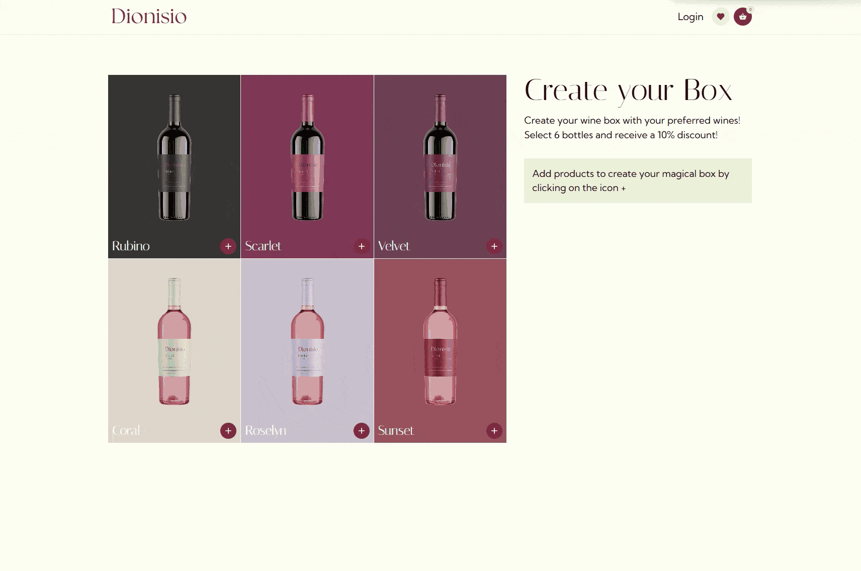
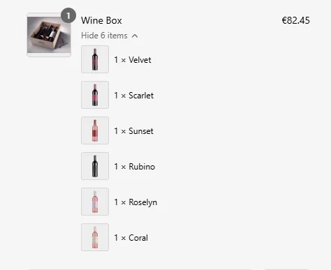
A "mix and match bundle" is a sales strategy that gives customers the freedom to create their own personalized product sets. Unlike traditional bundles with pre-selected items, mix and match bundles allow customers to choose the specific products they want within a designated group. Often, mix and match bundles are offered at a discounted price compared to purchasing each item individually. This incentivizes customers to buy more and increases the average order value for the business.
Shopify Checkout
This functionality uses Shopify Checkout Extensions in order to create a real bundle of products even at the checkout!
All plans
This Add-On is included in all plans.
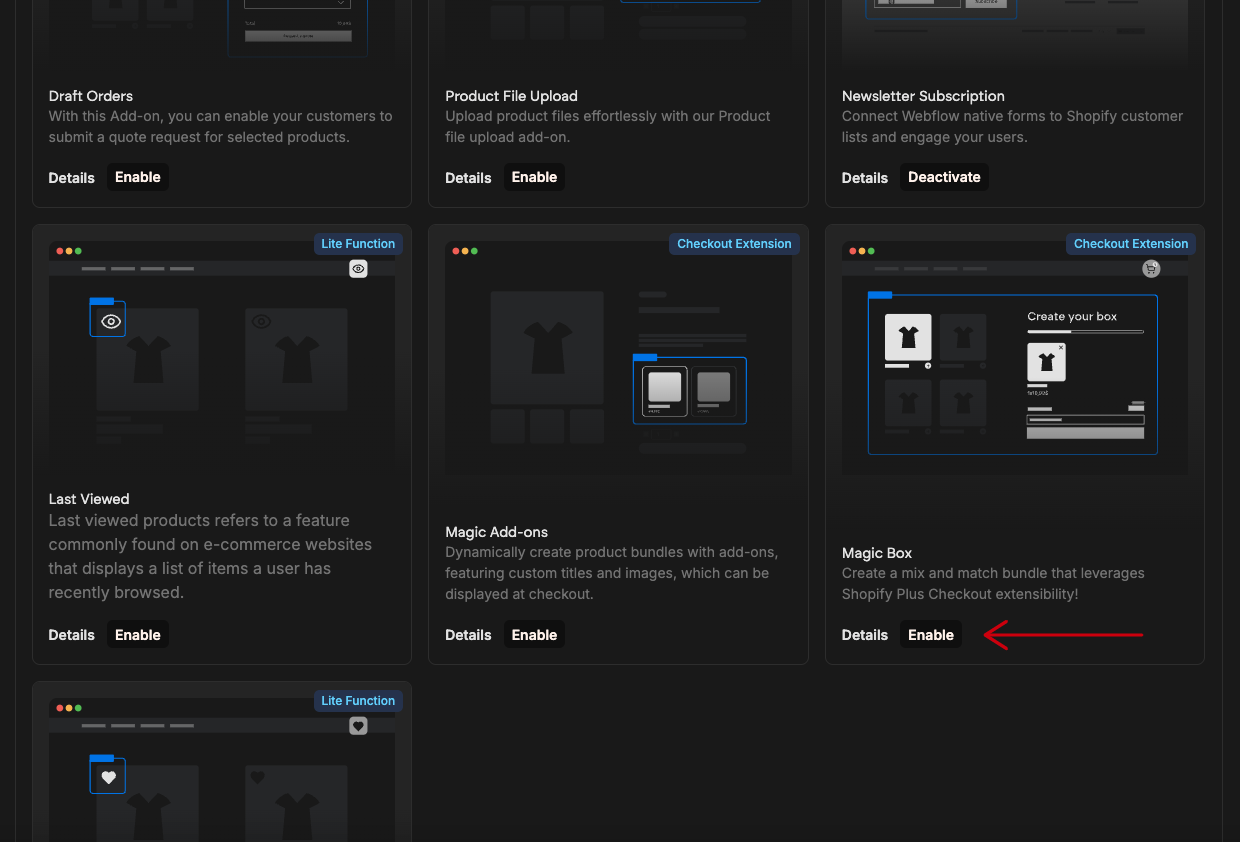
Activate add-on
This Add-On requires activation. You need to enable the add-on on the Smootify Dashboard of the site you are designing.
How to configure [Shopify]
Activate the Add-on
To turn on the Magic Box feature, go to your project in the Smootify dashboard and activate it within Sites add-ons.
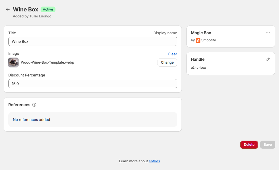
Create the Magic Boxes
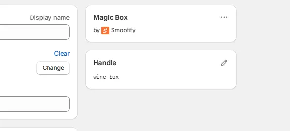
If you wish to easily show a different title, image and offer a discount price to your customers create Magic Boxes metaobjects from your Shopify dashboard > Content > Metaobjects > Magic Box
How to configure [Webflow]
Copy the Component
To kickstart your Magic box just copy the component below
Magic Box
Copy Element
Style it
Style it based on your own style!
Component Structure
The component is made by 2 main Custom Elements:
- Magic Box Wrapper
- Magic Box Cart
Magic Box Wrapper
The magic box wrapper is a Custom Element with tag smootify-magic-box.
This element requires to include inside it 2 elements:
The products that you want to allow to be purchasable in the box
Inside this element you can create the listing of the products in any way you wish either CMS or Attributes to load them directly from Shopify
Magic box Cart
Is a special Add to Cart element that will allow you to effectively add the selected products to the cart as a unique box
Options
Let's see all customization options you can use on the Magic Box Wrapper.
First of all you have to associate the wrapper to a Magic box! You have 2 ways:
If you created a metaobject magic box and you want to associate the wrapper to it, just use the Custom Attribute:
Where the handle can be found on the Shopify Backend
Min/Max/Step Quantities
You can modify minimuum, maximuum and steps required to enable the add to cart with respectively 3 attributes:
E.g: if you set min to 3, max to 12 and step to 3, users can purchase the box if it contains 3,6,9 or 12 products.
Unique Items
If you want to prevent adding multiple quantities of each product you can add the attribute
Categories
For certain situations you might want to divide products in different categories and avoid purchasing multiple items for the same category.
To define a category you have to wrap each product group in a different Custom Element with tag smootify-box-category.
On the Category Custom Element you have to add the attribute:
Categorization is pretty usefull if you need to create for example a product like a Desktop Computers where you can create your own computer by adding a piece of each category (Motherboard, GPU, ram, hdd, etc..)
Automatically when you add a product inside a smootify-box-category and you've designed the categories to be inside a Slider / Tab, the Slider / Tab will move to the next Slide / Tab.
If you want to prevent adding multiple quantities of each category you can add the attribute:
If you want to automatically remove products when selecting a new product of the same category add the attribute:
If you want to allow purchasing only if there is at least one item per category add the attribute:
Add to Cart Errors
The Magic Box Wrapper can trigger a lot of different errors when you add products to the cart, for example you can limit how many items you can add to the box. So you can customize the different errors that will trigger by adding the following custom attributes on the Add to Cart element
Box is full
This error pops up when you try to add more items to the box but it already reached the maximuum
Too many items
This error pops up when you try to add a quantity of items to the box that will overfill it
Only one
This error pops up when you try to add a product that is already in the box and the option unique items is active
Only one per category
This error pops up when you try to add a product of a category that is already in the box and the option unique per category is active
Magic Box Cart
The Magic Box Cartis a Custom Element with tag smootify-magic-box-cart and is basically the list of items added to box and a submit button.
The submit button is made with the same exact structure of the Add to Cart Button.
Items List
The items list is made with a Custom Element placeholder that has the tag box-item. This placeholder will be repeated once for each item added to the box.
Inside this custom element you can use several attributes to dynamically design the element.
Product Title
The "product title" is simply the name you give to your product, you can render it on any text element by just adding the attribute
URL
Any link element can be replaced with the Product URL by just using the attribute:
Inform Smootify about your Product CMS collection slug
To prevent 404 errors, particularly when your Product CMS collection slug is not 'product', accurately specify the slug you used in the Webflow CMS collection within the Smootify script configurations.
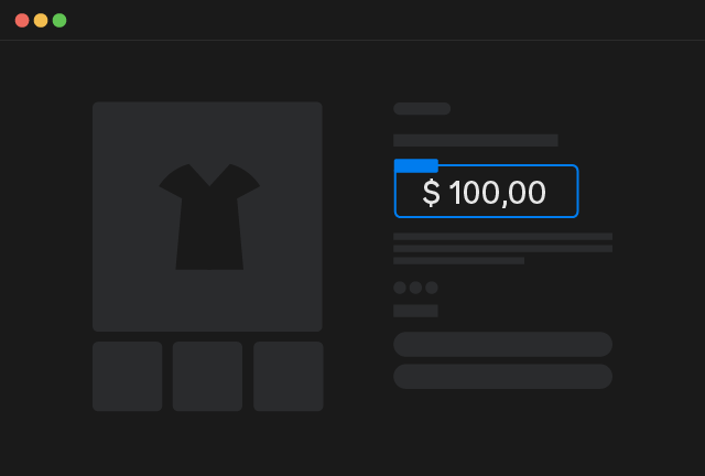
Price
Price that reflects the selected item and the customer's market, beyond the initial variant price synced in the Webflow CMS, this specific Smootify Custom Element is required.
Price
Copy Element
Description
The product description allows you to convey essential details about your product, such as its features, materials, dimensions, and usage instructions. You can render it inside any Rich Text Element by just adding the attribute
Vendor
In Shopify, the "vendor" field designates the manufacturer, supplier, or brand of a product. It's a way to track and display the source of your products.
You can render the vendor on any text/link element by using the attribute:
Featured Image
This is the specific image associated with the variant added to the box. It's a crucial visual element that helps customers understand the differences between the various options of a product. You can render the featured image on any Image or Div (as a background image) just by using the attribute:
Line Item Quantity
This is the quantity of that specific item added to the box. You can mark any text element with the Custom Attribute:
Line Item Category
This is the category associated to the item if you used Magic Box Wrapper categories.
You can mark any text element with the Custom Attribute:
Remove from Box
To create a remove from box element, you have to create a Custom Element with tag button and add the attribute:
Box Cart Elements
There are many dynamic elements that you can use in order to enhance the UX of your cart, for example to let your customer know that he needs to add other items to the box in order to purchase it, etc.
Current Quantity
You can mark any text element with the attribute:
to show the current quantity of items added to the box.
Max Quantity
You can mark any text element with the attribute:
to show the max quantity of items added to the box.
Left Quantity
You can mark any text element with the attribute:
to show the left quantity of items.
Left Quantity Width
You can mark any div element with the attribute:
to set the size of the div as the left quantity of items as a percentage.
Discount Percentage
You can mark any text element with the attribute:
to show the max quantity of items added to the box.
Missing Categories
You can mark any text element with the attribute:
to show the categories that are missing in the box to allow the purchase.
By default the missing categories are divided by , . You can change this behaviour by adding another custom attribute:
If you use as value repeat, the item itself will be duplicated once for each missing category.
Box Cart Visibility
To dynamically show/hide elements based on the box cart state you can use Custom Attributes like:
Can purchase
The element with the following attribute will show up only if the box can be purchased (so for example, min, max, steps and categories are satisfied)
Cannot purchase
The element with the following attribute will show up only if the box cannot be purchased (so for example, min, max, steps and categories are not satisfied)
Box Cart Properties
Just like the Add to Cart component, even the Magic Box Cart supports custom properties, you have just to add additional inputs in the form provided by the component!
JS Extensibility
Each time an item is added or removed from the box, an event is triggered on the document body.
Use this event to dynamically update the box's title and image.
The SmootifyMagicBox element exposes the following interface:
Example
For example you can modify the title of the magic box and the image based on the items added or removed