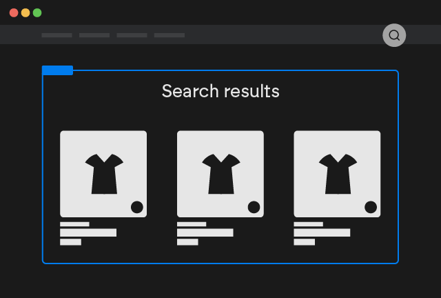
Search Page
Your first document
The search page is a fundamental component of your Shopify online store, designed to help customers quickly find the products they desire. Unlike predictive search, which offers real-time suggestions as the user types (with a limit of 10 results), the search page displays the complete list of results matching the search query.

How the Search Page Works
When a customer enters a keyword into the search bar of your Shopify store and presses "Enter" or clicks the search icon, they are redirected to the search page. This page presents:
- Complete List of Results: All products that match the search keyword are displayed in a list.
- Pagination: If the number of results is large, the search page divides them into multiple pages for easier navigation.
Benefits of the Search Page
- Comprehensive Product Discovery: Allows customers to explore the entire catalog of products relevant to their search.
- Improved User Experience: Offers a clear and intuitive interface for searching and selecting products.
- Increased Conversions: Helps customers quickly find what they are looking for, increasing the likelihood of purchase.
Difference Between Predictive Search and Search Page
- Predictive Search:
- Shows real-time suggestions as the user types.
- Limits results to a maximum of 10.
- Helps quickly find the most popular or relevant products.
- Search Page:
- Displays the complete list of results after the user presses "Enter."
- Has no limit to the number of results displayed. (Max 250 products per page)
How to Setup [Webflow]
Copy our Component
Search Page
Copy Element
Customize the Attributes
On the Custom Element search-page there are different Custom Attributes that you can modify:
Limit
You can modify the number of search results loaded by modifying the attribute
limitnumberBy default it's set as 50. You can set max 250
Disable Scroll
If you want to disable scroll when products are rendered add the attribute:
disable-scrolltrueDisable Scroll on Load More
If you want to disable scroll when more products are loaded add the attribute:
disable-scroll-on-load-moretrueAnimation Name
The component uses Motion.dev to animate the card loading by default the animation used is fade, you can modify it by changing the attribute
animationanimation nameWhere animation name can be: scale, fade, slide, slideBlurred, fadeBlurred
Animation Duration
By default the animation is set with a duration of 0.5s, you can modify it by changing the attribute:
durationsecondsStagger
By default the products are animated with a stagger of 0.1s, you can modify it by changing the attribute:
staggersecondsEasing
By default the products are animated with an ease-in easing, you can modify it by changing the attribute:
easingeasing formulaWhere easing formula can be: linear, ease, ease-in, ease-out, ease-in-out
Style the Search Form
Inside the component you will find a Form with a text input and a submit button, style it according to your needs
Style the Grid Element
Inside the component you will find a Grid Element that will contain all searched products, style it according to your needs
Style the Pagination Elements
Inside the component you will find 4 pagination buttons, with respectively the attributes:
data-actionnextdata-actionprevdata-actionloadand
data-actionload-in-viewYou can style them according to your needs, do not keep all 4 buttons at the same time, or you use previous/next or you use one of the load more
[Optional] Design the Product Template item
You will find already a Pre-made example inside the component, if you don't like it you can either start from scratch or use other pre-made examples
Copy and paste the Product Custom Element inside the grid element of the Component.
Product Custom Element
Copy Element
Inside the Product Custom Element you can insert any static Webflow element.
For all the dynamic elements you can use inside the Product Custom Element with attributes or with other specific custom elements refer to the elements documentation
Copy and paste any of our pre-made example inside the grid element of the component.
Search Page
Copy Element
Naturally you can insert any Webflow element you desire inside the pre-made examples.
For all the dynamic elements you can use inside the Product Custom Element with attributes or with other specific custom elements refer to the elements documentation
Set the data-id attribute if you started from scratch
If you started from scratch add the necessary data-id attribute.
data-idsearchStyle the Empty State
Inside the component you will find an element with the attribute
searchempty-stateThis element will show up only and exclusively when there are no search results for that query
Additional Attributes
Inside the search-page Custom Element you can use the following Attributes if you wish
Query
You can mark any text element as the query used for the search by adding the attribute
searchqueryCount
You can mark any text element as the search results count by adding the attribute
searchcount